My Role
Between 2017-2018, I worked on several Design Sprints for Oak, a meditation app by Kevin Rose (Digg, TrueVentures).
As Product Design Director at AJ&Smart, I contributed to product strategy, product design, Sprint facilitation and design management.
Designed with Jonathan Courtney, Fedor Shkliarau, Rob Hamblen, Isabell Hühnel. Illustrations by Sarah Kilcoyne. Developed by Taylor Robinson.
Oak is a meditation app. It guides users towards building a meditation routine, based on breathing exercises and traditional meditation techniques.
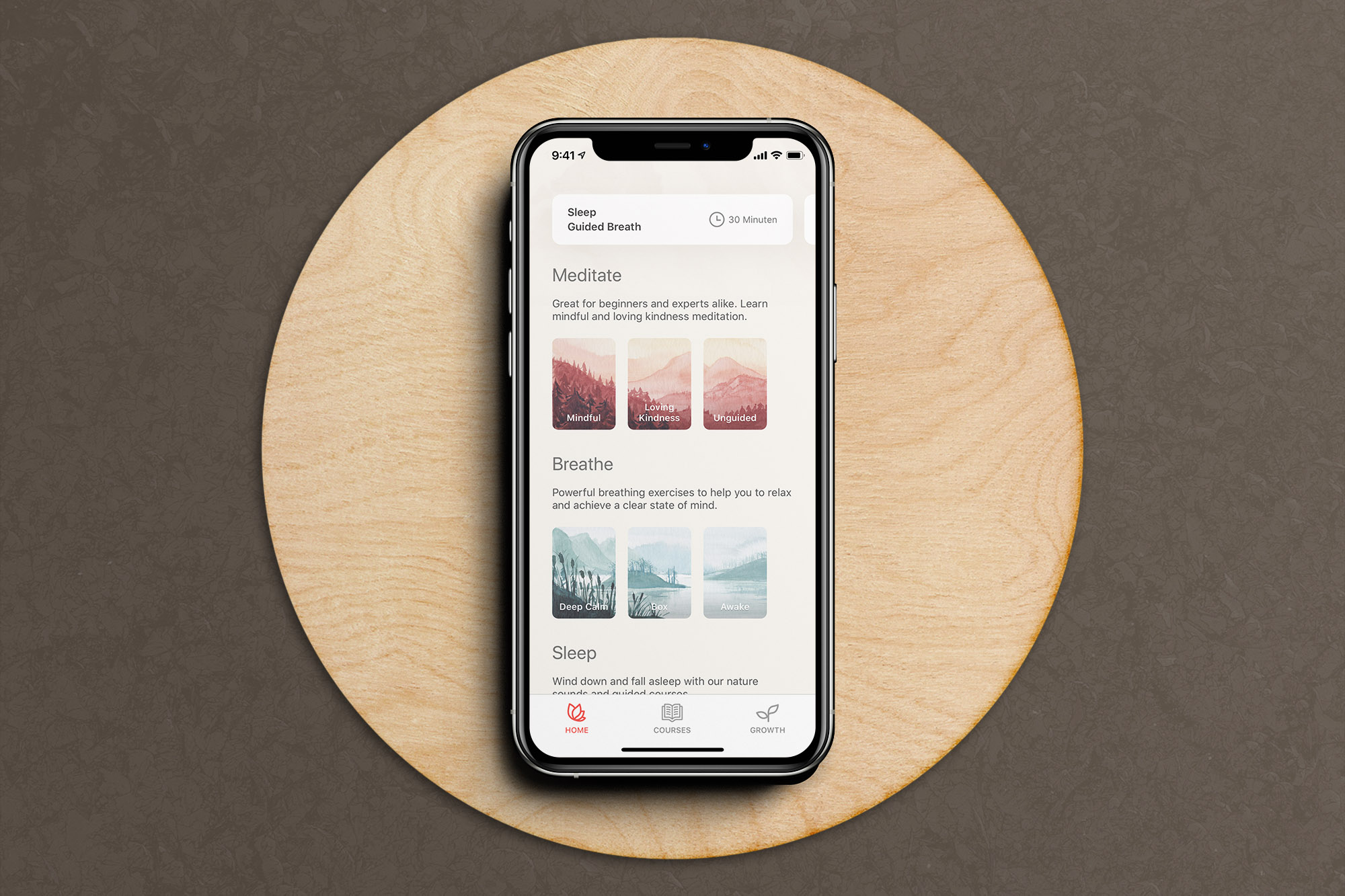
I worked on several remote Design Sprints for Oak's founder Kevin Rose (meditation advocate, Partner at True Ventures and previously founder of Digg). Our team turned Oak's first version into a refined, beautifully designed product that helps a community of tens of thousands of users to meditate every day.
The starting point
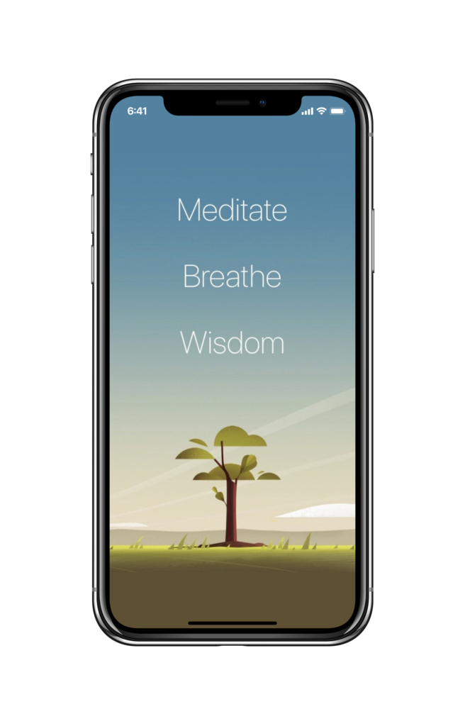
The first version of Oak was a purposely focused and simple meditation timer. It primarily targeted an audience of body hackers and "meditation geeks".
For the next version, Oak's founder wanted to turn it into a versatile tool to make meditation more accessible.
The Challenge
When we began working on Oak, it had already gained some traction among experienced meditators that loved it for its simplicity. Oak's founder Kevin is a big proponent of meditation and intended Oak to help people on their journey towards making meditation a daily habit.
Our intention with Oak is to teach our users the fundamentals needed to practice app-free traditional meditation.
Kevin Rose, Introducing: Oak
Other meditation apps like Headspace or Calm successfully positioned themselves as bringing meditation to a mass audience. Oak needed to differentiate itself and offer a clear value proposition of its own. It was primarily intended for experienced meditators, however, we needed to find a way to assist beginners as well, and provide value users couldn't find anywhere else.
To find out more about Oak's challenges, our team interviewed both experienced meditators and curious beginners, and asked them for their thoughts on Oak's first version. Their feedback allowed us to identify and prioritize key challenges.
User feedback
Oak's early version left users to figure out themselves what type of meditation to try. It lacked resources on the different meditation practices didn‘t help beginners to meditate independently.
I can’t say that I’m a meditation nut or anything, but when I go on retreats, or even a class, having a teacher makes all the difference to understanding the benefits of the practice and if I’d continue. This seems like it's lacking that guidance.
A user tester with meditation experience on Oak 1.0
Since it takes time to notice the positive effects of meditation, many beginners gave up too soon. Oak's incentive was the abstract notion of growing a stylized oak with each meditation session. Most beginners couldn't relate to this metaphor.
I don’t really care about growing that oak... I have no idea what it means and how it relates to me. I want to feel like I’m on a journey and that I’m progressing. The tree is not enough.
A user tester who was just beginning to meditate on the visual metaphor of growing a tree in Oak 1.0
Our Approach
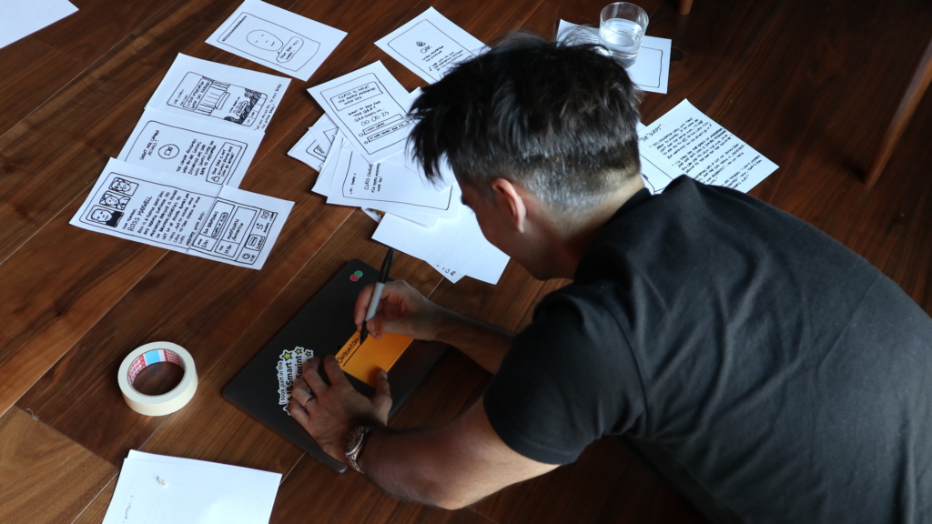
Throughout several Design Sprints, we built Oak's entire product strategy, user experience and art direction in iterative loops.
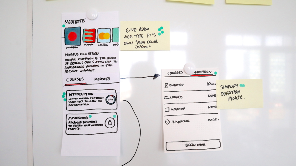
In each Sprint, we started by prioritizing a problem to solve, ideated and sketched new features and improvements, decided which approach to test, created an interactive prototype, and validated it through qualitative user testing.
Each new iteration was tested before creating production-ready designs and handing them over to the developer.
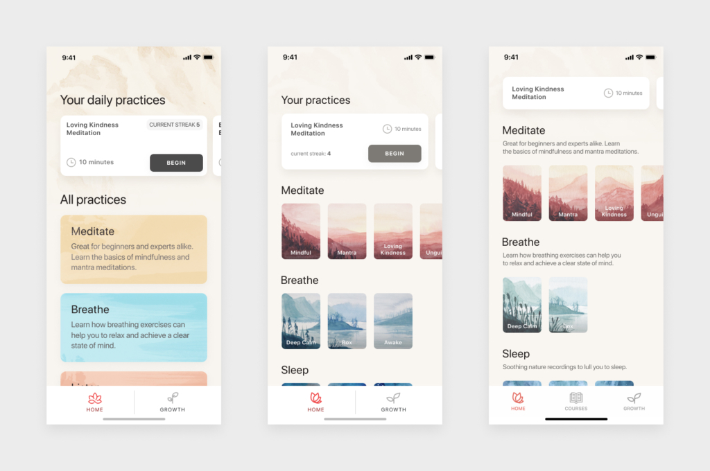
Defining Oak's Value Proposition
Our initial interviews with meditation experts and beginners indicated that apps like Headspace and Calm made meditation accessible for beginners, but were less appealing for experienced meditators. These practitioners wanted to deepen their practice.
Oak for experienced meditators
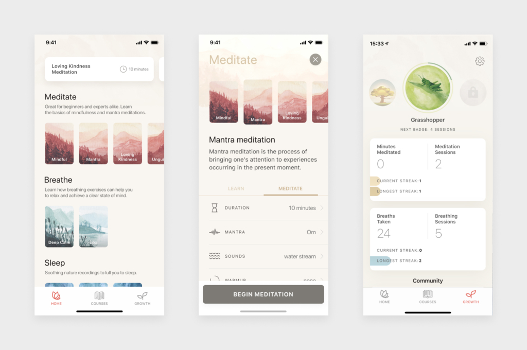
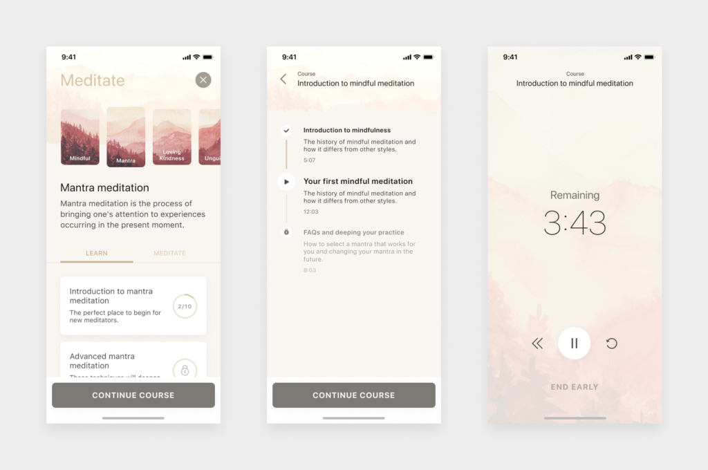
Based on these learnings, we hypothesized that Oak could offer the most value as a companion app for experienced meditators when it made experimentation with different types of meditation, breathing exercises, and relaxation techniques accessible, right from the home screen.
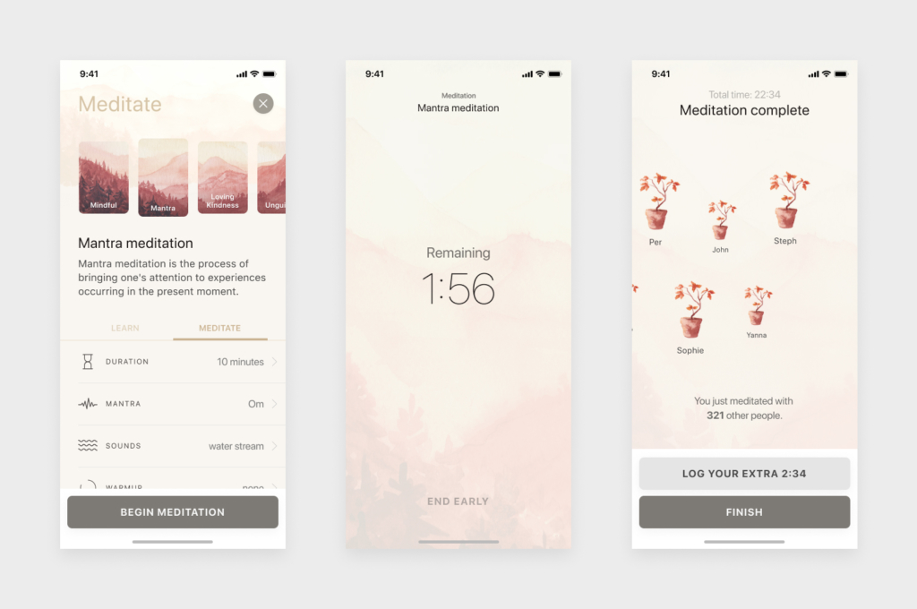
A redesigned profile screen quantified users' meditation habit by showing them an overview of their progress, previous sessions, and who else is currently meditating with Oak.
Oak for beginners
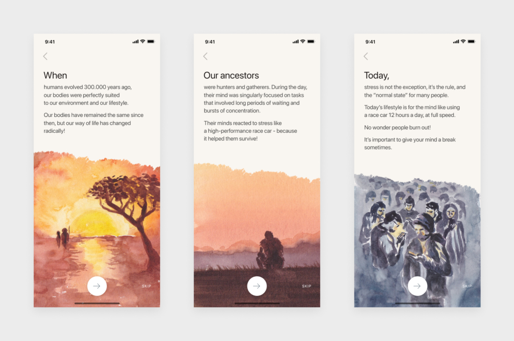
To support newcomers to meditation in building a meditation routine as well, we reframed meditation from a spiritual practice ("This is for monks and ascetics, but not for me") to an accessible tool for everybody, with tangible benefits grounded in human evolution and neuroscience.
In addition to this, we added short onboarding courses for each meditation type to help beginners get started.
Design Direction
Aesthetics and art direction played a big role in differentiating Oak from other meditation apps. We wanted to remove anything that distracts users from Oak's purpose, and create a place where users could rest their mind.
We wanted Oak to look modest and simple, but also intimate and welcoming. For this, we researched temple architecture and classical landscape paintings and attempted to apply their aesthetics to digital technology.
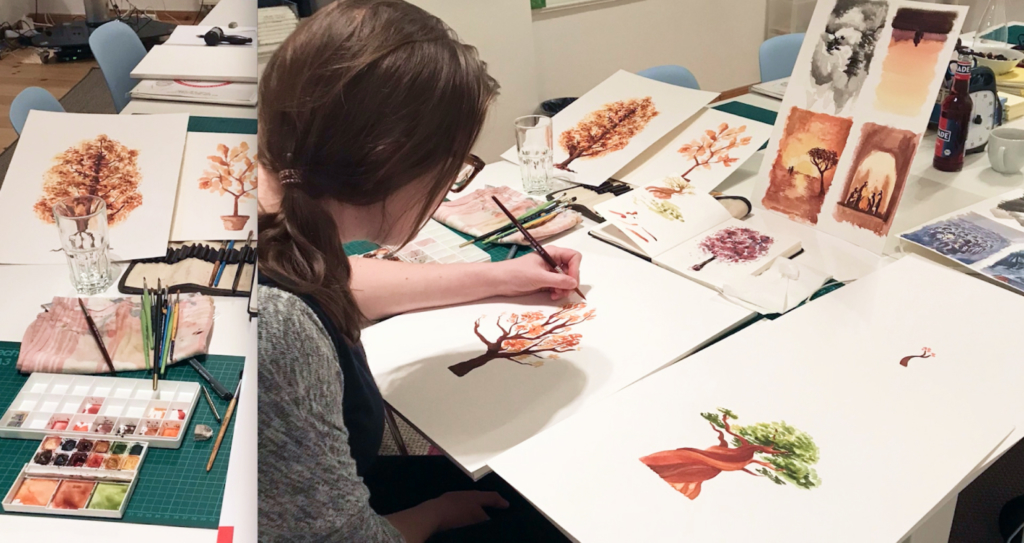
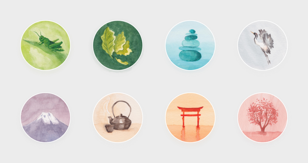
A key component of this was creating custom illustrations. We worked closely with artist Sarah Kilcoyne to define a unique, painterly look that conveys both warmth and calmness.
The hand-made backgrounds and illustrations were combined with calm and deliberate typography, and clean UI elements.


Results
After launching in 2018, Oak's redesign quickly build a loyal following of meditators everywhere. Tens of thousands of users engage with it daily. Oak received an exceptionally high rating of 4.8 out of 5, based on 21.9K reviews. In 2019, Oak was acquired by Big Sky Health.
Oak was featured in Apple App Store's "New Apps We Love" and Product Hunt's Product of the Day in 2018.

Kevin, our client, was very pleased with the outcome.
I can't say enough good things about AJ&Smart. They were great partners and really drove the redesign and layout. LOVED the sprint progress with them. Highly recommend if you're looking for a design partner.
Kevin Rose, founder of Oak
